
Cartoon from here
The Gini Coefficient – Measuring Inequality
The Gini coefficient is a value ranging from 0 to 1 which measures inequality. 0 represents perfect equality – i.e everyone in a population has exactly the same wealth. 1 represents complete inequality – i.e 1 person has all the wealth and everyone else has nothing. As you would expect, countries will always have a value somewhere between these 2 extremes. The way its calculated is best seen through the following graph (from here):
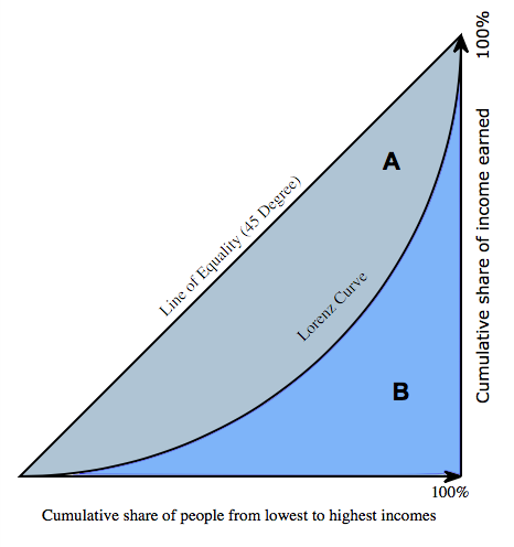
The Gini coefficient is calculated as the area of A divided by the area of A+B. As the area of A decreases then the curve which plots the distribution of wealth (we can call this the Lorenz curve) approaches the line y = x. This is the line which represents perfect equality.
Inequality in Thailand
The following graph will illustrate how we can plot a curve and calculate the Gini coefficient. First we need some data. I have taken the following information on income distribution from the 2002 World Bank data on Thailand where I am currently teaching:
Thailand:
The bottom 20% of the population have 6.3% of the wealth
The next 20% of the population have 9.9% of the wealth
The next 20% have 14% of the wealth
The next 20% have 20.8% of the wealth
The top 20% have 49% of the wealth
I can then write this in a cumulative frequency table (converting % to decimals):

Here the x axis represents the cumulative percentage of the population (measured from lowest to highest), and the y axis represents the cumulative wealth. This shows, for example that the the bottom 80% of the population own 51% of the wealth. This can then be plotted as a graph below (using Desmos):

From the graph we can see that Thailand has quite a lot of inequality – after all the top 20% have just under 50% of the wealth. The blue line represents how a perfectly equal society would look.
To find the Gini Coefficient we first need to find the area between the 2 curves. The area underneath the blue line represents the area A +B. This is just the area of a triangle with length and perpendicular height 1, therefore this area is 0.5.
The area under the green curve can be found using the trapezium rule, 0.5(a+b)h. Doing this for the first trapezium we get 0.5(0+0.063)(0.2) = 0.0063. The second trapezium is 0.5(0.063+0.162)(0.2) and so on. Adding these areas all together we get a total trapezium area of 0.3074. Therefore we get the area between the two curves as 0.5 – 0.3074 ≈ 0.1926
The Gini coefficient is then given by 0.1926/0.5 = 0.3852.
The actual World Bank calculation for Thailand’s Gini coefficient in 2002 was 0.42 – so we have slightly underestimated the inequality in Thailand. We would get a more accurate estimate by taking more data points, or by fitting a curve through our plotted points and then integrating. Nevertheless this is a good demonstration of how the method works.
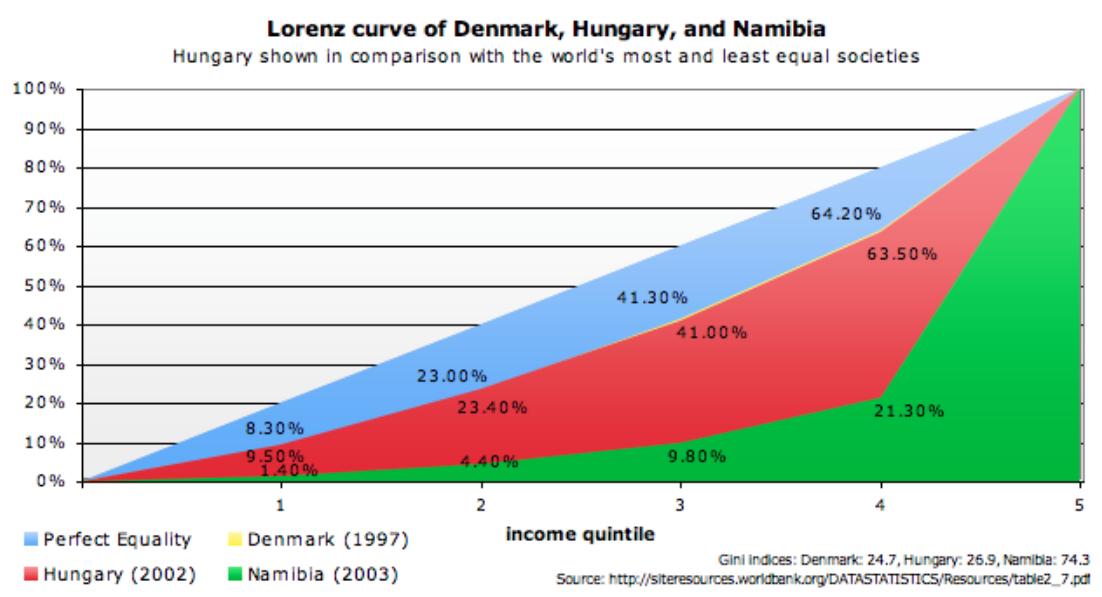
In this graph (from here) we can see a similar plot of wealth distribution – here we have quintiles on the x axis (1st quintile is the bottom 20% etc). This time we can compare Hungary – which shows a high level of equality (the bottom 80% of the population own 62.5% of the wealth) and Namibia – which shows a high level of inequality (the bottom 80% of the population own just 21.3% of the wealth).
How unequal is the world?

We can apply the same method to measure world inequality. One way to do this is to calculate the per capita income of all the countries in the world and then to work out the share of the total global per capita income the (say) bottom 20% of the countries have. This information is represented in the graph above (from here). It shows that there was rising inequality (i.e the richer countries were outperforming the poorer countries) in the 2 decades prior to the end of the century, but that there has been a small decline in inequality since then.
If you want to do some more research on the Gini coefficient you can use the following resources:
The intmaths site article on this topic – which goes into more detail and examples of how to calculate the Gini coefficient
The ConferenceBoard site which contains a detailed look at world inequality
The World Bank data on the Gini coefficients of different countries.
IB teacher? Please visit my new site http://www.intermathematics.com ! Hundreds of IB worksheets, unit tests, mock exams, treasure hunt activities, paper 3 activities, coursework support and more. Take some time to explore!
Please visit the site shop: http://www.ibmathsresources.com/shop to find lots of great resources to support IB students and teachers – including the brand new May 2025 prediction papers.
Leave a Reply