Climate Change: Modelling Global Sea Ice
Modelling the change of sea ice over time (global sea ice extent) is an important metric for understanding one of the (many) effects of climate change. This is a good example of how we can use some good quality secondary data, CSV files and Desmos to represent this data.
Finding the data
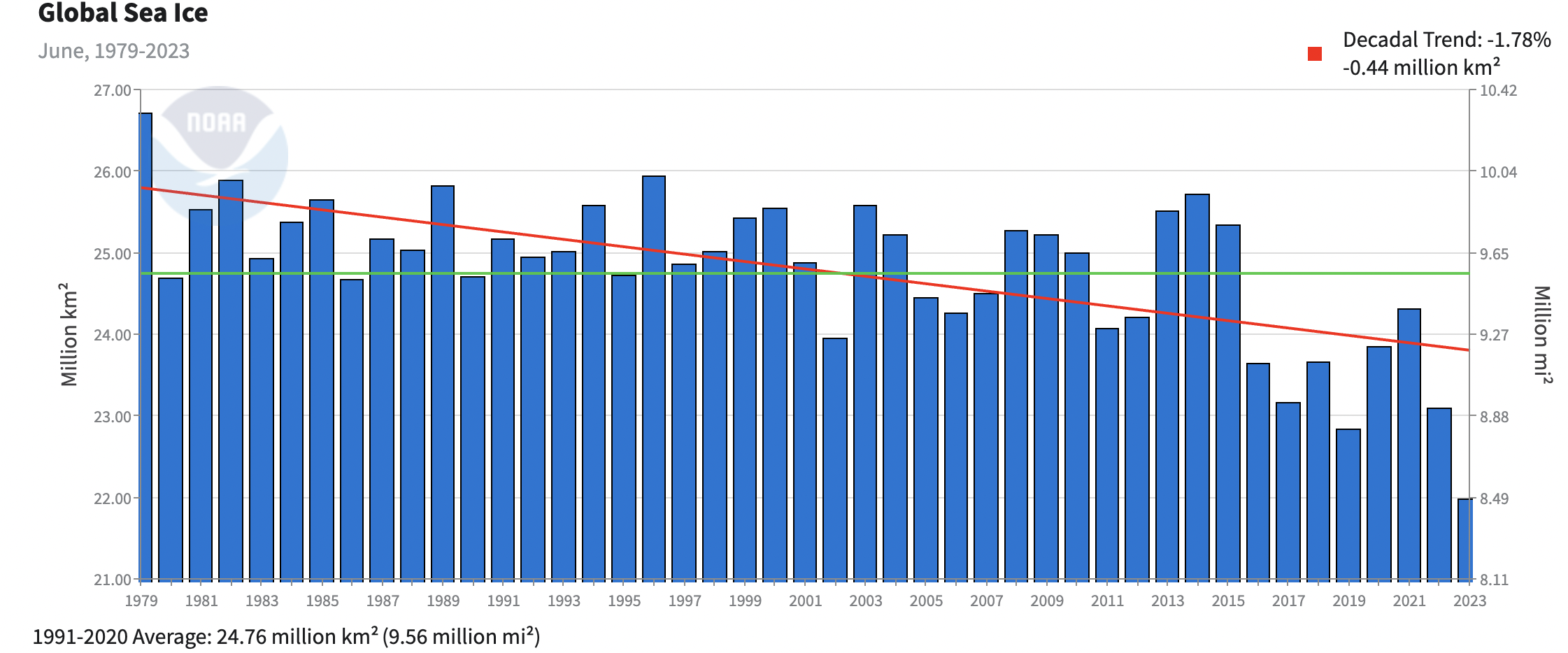
Any data which is in a CSV or Excel file is easy to import into Desmos. So we can go to the National Centers for Environmental Information and download a CSV file for global ice extent for every month since 1979. We can see a bar chart for this yearly data from the same site above, but can we do something more interesting with this?
Box and whisker plot
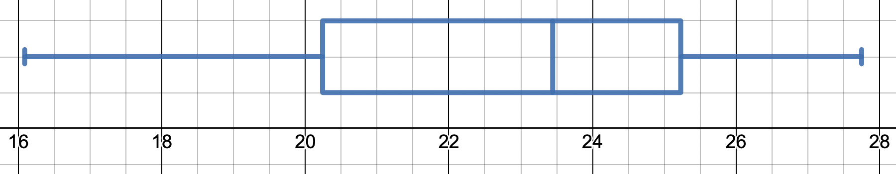
Using the list function in Desmos we can paste raw data straight into a list. In this case I pasted in the 532 data points for ice coverage. We can then find out from Desmos the following key values:
Mean: 22.9
Median: 23.4
Lower Quartile: 20.2
Upper Quartile: 25.2
We can then plot this data as a boxplot using the Desmos boxplot function. This gives a nice overall visual representation of the data we’re looking at. However as the data has seasonal variation we could also do with representing this data in a different way.
Changing the data
I changed the CSV data so that each January was assigned a 1, each February a 2, up until December being assigned a 12. I could then copy and paste this data into Desmos to give the following graph:
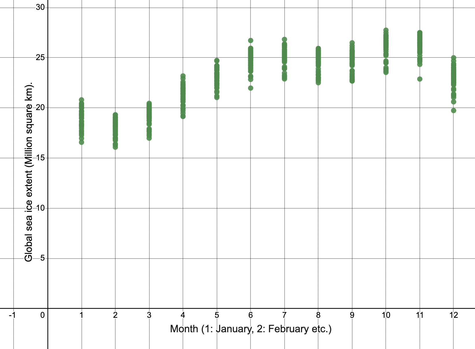
We can see the months on the x axis and the global sea ice extent in millions of square km on the y axis. We can see that from year to year that is quite a lot of variation, and we can also see seasonal variations.
Next we can plot the middle points for each month visually (purple) and use Desmos’ regression line to fit a trigonometric curve:
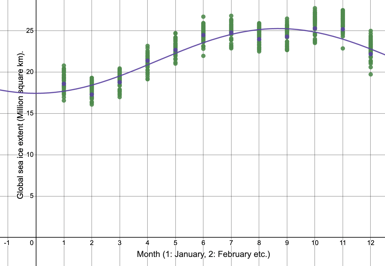
The trigonometric model is a reasonable fit with an R squared value of 0.91, and does capture the oscillation of sea ice extent across the months. Next we want to see if global sea ice is decreasing. To see this visually, let’s plot the last 4 1/2 years of data in red:

We can see that we’re starting to consistently below average ice coverage. Let’s do a quick test to see if this is by chance. We can count the red dots above and below our average regression line to get an idea as to how many months over the past 4 1/2 year have been above average and how many below average. We get 42 months below average and 12 months above average. Indeed January, February and June have all set records for the lowest monthly levels recorded.
Can we be more mathematical?
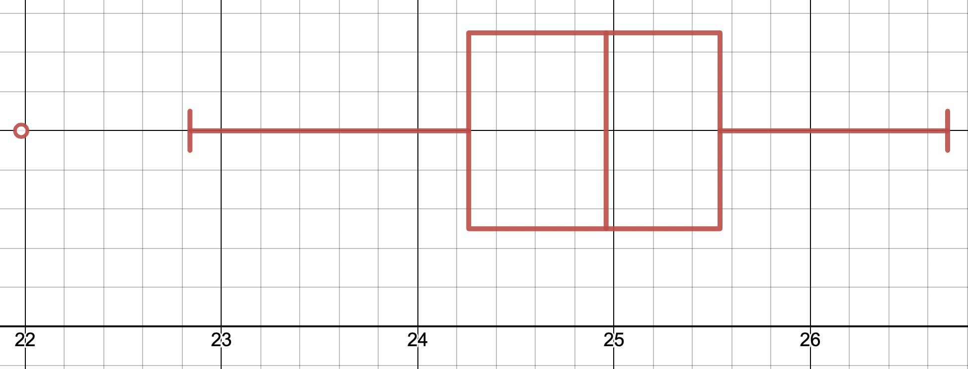
Everything we’ve seen so far would suggest that we’re seeing anomalies in 2023, but we can actually see if these qualify as outliers. To do this I took just the data for June, and added this to a list on Desmos. I then created a boxplot (shown above). Here we have the data for June 2023 a very clear outlier for our data. The outlier boundary for this data would be anything less than 24.26 – 1.5×1.28 = 22.34. We can see that 21.98 is very much an outlier based on the last 50 years of data.
Antarctic sea ice

We can see a similar trend just by looking at the above graph for Antarctica ice from Mercator-Ocean. This is a nice use of visual graphics. We can see the thick grey line representing the median value across 1981-2010. The light grey regions represents the 25th and 75th percentile, and the dotted grey represents the 10th percentile and 90th percentile for this timeframe. We can then see 2023 in black and then red is really a huge outlier – with the current data about 2.5 million square km below median and about 1.5 million square km below the 10th percentile data.
This is just a very brief example of some nice visualisation methods to represent the data behind one aspect of global warming. These graphs look pretty scary – 2023 looks somewhat “off the charts” when current models stop fitting the data. Changing levels in sea ice extent will have profound effects to the Earth’s climate – so this is certainly an important area for scientists to keep monitoring and updating their models.
IB teacher? Please visit my new site http://www.intermathematics.com ! Hundreds of IB worksheets, unit tests, mock exams, treasure hunt activities, paper 3 activities, coursework support and more. Take some time to explore!
Please visit the site shop: http://www.ibmathsresources.com/shop to find lots of great resources to support IB students and teachers – including the brand new May 2025 prediction papers.