Maths of Global Warming – Modeling Climate Change
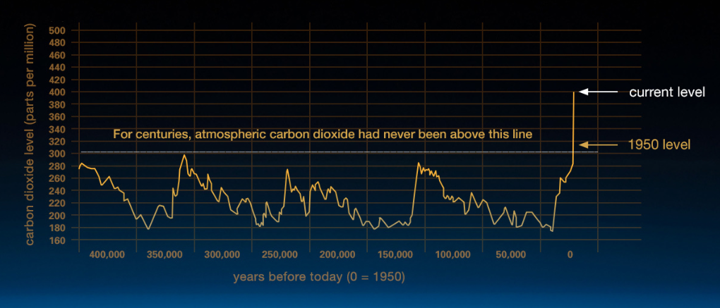
The above graph is from NASA’s climate change site, and was compiled from analysis of ice core data. Scientists from the National Oceanic and Atmospheric Administration (NOAA) drilled into thick polar ice and then looked at the carbon content of air trapped in small bubbles in the ice. From this we can see that over large timescales we have had large oscillations in the concentration of carbon dioxide in the atmosphere. During the ice ages we have had around 200 parts per million carbon dioxide, rising to around 280 in the inter-glacial periods. However this periodic oscillation has been broken post 1950 – leading to a completely different graph behaviour, and putting us on target for 400 parts per million in the very near future.
Analysising the data
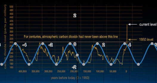
One of the fields that mathematicians are always in demand for is data analysis. Understanding data, modeling with the data collected and using that data to predict future events. Let’s have a quick look at some very simple modeling. The graph above shows a superimposed sine graph plotted using Desmos onto the NOAA data.
y = -0.8sin(3x +0.1) – 1
Whilst not a perfect fit, it does capture the general trend of the data and its oscillatory behaviour until 1950. We can see that post 1950 we would then expect to be seeing a decline in carbon dioxide rather than the reverse – which on our large timescale graph looks close to vertical.
Dampened Sine wave

This is a dampened sine wave, achieved by adding e-x to the front of the sine term. This achieves the result of progressively reducing the amplitude of the sine function. The above graph is:
y = e-0.06x (-0.6sin(3x+0.1) -1 )
This captures the shape in the middle of the graph better than the original sine function, but at the expense of less accuracy at the left and right.
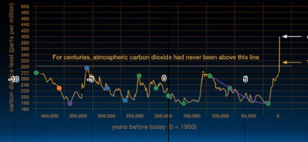
Polynomial Regression

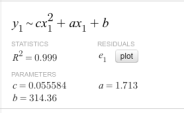
We can make use of Desmos’ regression tools to fit curves to points. Here I have entered a table of values and then seen which polynomial gives the best fit:


We can see that the purple cubic fits the first 5 points quite well (with a high R² value). So we should be able to create a piecewise function to describe this graph.
Piecewise Function

Here I have restricted the domain of the first polynomial (entered below):

Second polynomial:


Third polynomial:


Fourth polynomial:

Finished model:

Shape of model:

We would then be able to fit this to the original model scale by applying a vertical translation (i.e add 280), vertical and horizontal stretch. It would probably have been easier to align the scales at the beginning! Nevertheless we have the shape we wanted.
Analysing the models
Our piecewise function gives us a good data fit for the domain we were working in – so if we then wanted to use some calculus to look at non horizontal inflections (say), this would be a good model to use. If we want to analyse what we would have expected to happen without human activity, then the sine models at the very start are more useful in capturing the trend of the oscillations.
Post 1950s

Looking on a completely different scale, we can see the general tend of carbon dioxide concentration post 1950 is pretty linear. This time I’ll scale the axis at the start. Here 1960 corresponds with x = 0, and 1970 corresponds with x = 5 etc.

Actually we can see that a quadratic fits the curve better than a linear graph – which is bad news, implying that the rates of change of carbon in the atmosphere will increase. Using our model we can predict that on current trends in 2030 there will be 500 parts per million of carbon in the atmosphere.
Stern Report
According to the Stern Report, 500ppm is around the upper limit of what we need to aim to stabalise the carbon levels at (450ppm-550ppm of carbon equivalent) before the economic and social costs of climate change become economically catastrophic. The Stern Report estimates that it will cost around 1% of global GDP to stablise in this range. Failure to do that is predicted to lock in massive temperature rises of between 3 and 10 degrees by the end of the century.
If you are interested in doing an investigation on this topic:
- Plus Maths have a range of articles on the maths behind climate change
- The Stern report is a very detailed look at the evidence, graphical data and economic costs.
IB teacher? Please visit my new site http://www.intermathematics.com ! Hundreds of IB worksheets, unit tests, mock exams, treasure hunt activities, paper 3 activities, coursework support and more. Take some time to explore!
Are you a current IB student or IB teacher? Do you want to learn the tips and tricks to produce excellent Mathematics coursework? Check out my new IA Course in the menu!
not enough math just use of desmos?